Washington Post: With new David Geffen Hall, the NYPhil returns on an optimistic note

For more information, please contact:
Andrea Chin, Communications Director
Email: [email protected]
Gary McCluskie, Principal
Email: [email protected]
Diamond Schmitt's design of David Geffen Hall is featured in an article by Michael Brodeur for The Washington Post.
Talk of renovations to remedy the hall’s chronic sonic problems started in the 1990s, when the orchestra still had the shakes from its last traumatic demolition job in the mid-1970s (and Philharmonic Hall made its grand lateral transformation into Avery Fisher Hall). Architects Philip Johnson and John Burgee, along with acoustician Cyril M. Harris, had lent the hall a leaner look with cleaner lines but zero soul.
Cycles of subsequent plans materialized and fizzled, and frustrations mounted within the ranks; at one point in the early aughts, the New York Philharmonic was ready to jump ship from Lincoln Center and run into the arms of Carnegie Hall. That didn’t happen.
In the past, the design of the hall was dictated by straight lines and orderly rows; a scheme — immediately disrupted by the continuous requisite supplementation of various baffles, panels and other acoustic treatments — attempted to improve the sound.
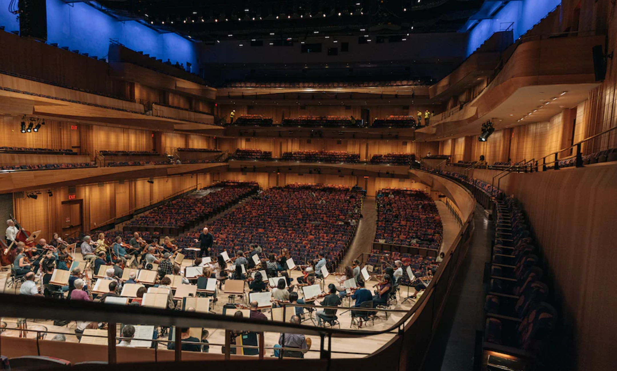
The new hall seems to anticipate these concerns with each contour of every wall — an undulating wood surface that again fuses old and new, form and function: The randomized undulations of the wood walls shape the sound while their classically informed vertical lines guide your eyes. The tiers themselves feel wrapped around you like shawls of oak, beech and walnut. A ring of blue light illuminates the perimeter of the uppermost tier.
In those upper tiers (favored by handfuls of construction workers at the rehearsal I attended), long single rows of single seats angle toward the stage. (The term “bus seats” is thrown around in the tour.) It’s a small but impactful highlight of the new hall’s emphasis on attention. A profoundly adjusted rake (i.e. slope of the floor) contributes to this. It gives the room the feel of an elongated bowl, and in concert with the curvature of the aisles — as well as a subtle system of three variations in seat widths — allows for unobstructed views from every seat.
To that end, wherever you are in the hall, the stage feels closer, because it is. The proscenium has been removed entirely and the stage brought forward 25 feet, fitted with flexible risers and parterre seating. Thus, the audience surrounds the stage. A blue and crimson pattern of rose petals diffusing over the seat backs reinforces the natural fall of one’s attention toward the music. It’s as if you’re inside the body of an instrument.
Read the full article here.